

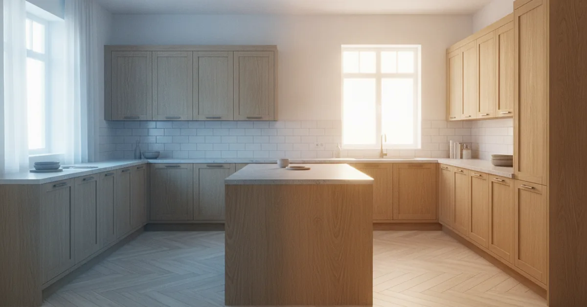
I’ll never forget the phone call. A client, whose kitchen we had just spent three months meticulously crafting, was in tears. The custom-mixed greige cabinets, which looked so sophisticated and warm in my workshop, appeared cold and almost purple in her home. She was convinced we had used the wrong paint. We hadn't. The culprit wasn't the finish; it was the cool, blue-toned LED recessed lights her electrician had installed throughout the kitchen. This is a scenario I've seen play out dozens of times. Homeowners spend tens of thousands on the perfect cabinetry, only to have their vision completely undone by a factor they barely considered: the color temperature of their light bulbs.
The Four Pillars of Light and Finish Harmony
Test Finishes In Situ: Never approve a cabinet color based on a sample seen in a showroom or workshop. You must test a
- Test Finishes In Situ: Never approve a cabinet color based on a sample seen in a showroom or workshop. You must test a large sample board in your own kitchen, observing it at different times of day (morning, noon, evening) and under your actual light fixtures.
- Match Light to Mood: The Kelvin (K) scale is your guide. Warm light (2700K-3000K) creates a cozy, traditional feel and enhances warm wood tones. Cool light (4000K-5000K) provides a crisp, modern, task-oriented environment that suits pure whites and cool grays.
- Beware of Metamerism: This is the technical term for when two colors appear to be the same under one lighting condition but different under another. It’s the reason that perfect greige can turn purple; the pigments in the paint are reacting differently to the light spectrum.
- Layer Your Lighting: A successful kitchen design uses multiple light sources. A combination of ambient (recessed cans), task (under-cabinet), and accent (pendants) lighting, each with a carefully chosen color temperature, gives you control over both function and mood.
Decoding the Language of Light: Kelvin Isn't Just a Number
When we talk about light in the cabinet-making world, we're not just talking about brightness (lumens); we're focused on color temperature, measured in Kelvin (K). Think of it as the color of the light itself, from a warm, candle-like glow to a bright, midday sun. This isn’t a minor detail. I’ve seen a $5,000 slab of Calacatta Gold marble with beautiful warm veining look completely washed out and sterile under 5000K lighting. The light literally stripped the character and investment value from the stone.
The common mistake is choosing lighting based purely on function or energy efficiency. A homeowner might install high-Kelvin “daylight” bulbs for clarity, not realizing they will fundamentally change how the human eye perceives the color of their cabinets. Warm colors and natural woods thrive under warm light; cool, stark whites and modern palettes are flattered by cooler light. A mismatch creates a visual conflict that makes a space feel “off,” even if you can’t pinpoint why.
How Light Temperature Interacts with Popular Cabinet Finishes
The interaction between light and finish is a science. Different pigments and wood species absorb and reflect light in unique ways. In my shop, we have a testing wall with multiple light sources specifically to show clients this effect. Here’s a breakdown of what I’ve observed in hundreds of projects.
| Cabinet Finish | Effect of Warm Light (2700K - 3000K) | Effect of Cool Light (4000K - 5000K) |
|---|---|---|
| Classic White (e.g., Benjamin Moore Chantilly Lace) | Becomes softer, creamier, and more inviting. It can pick up a slight yellow hue, which may or may not be desired. | Appears as a true, crisp, brilliant white. Ideal for a clean, modern aesthetic. Can feel sterile if too cool (over 5000K). |
| Greige & Taupe (e.g., Sherwin-Williams Agreeable Gray) | Enhances the beige/brown undertones, making the color feel warm, earthy, and grounded. | Pulls out the gray/blue/purple undertones. This is where a perfect greige can suddenly look lavender or battleship gray. |
| Natural Oak (White or Red) | Brings out the rich, golden, and honey tones in the wood grain. Creates a classic, cozy, and traditional feel. | Can wash out the wood's natural warmth, making it appear flatter, duller, and sometimes with a slightly greenish cast. |
| Dark Stains (Espresso, Walnut) | Highlights the red and brown undertones, adding depth and richness. The grain detail becomes more pronounced. | Mutes the warm undertones, making the finish appear more like a flat black or charcoal. Can hide some of the wood's natural character. |
| Navy Blue & Dark Green | Can make the color appear slightly muddy or black. Loses some of its vibrancy. | Keeps the color crisp and true to the swatch. The blue or green hue remains clear and saturated. |
The Wood Grain Variable: It's Not Just About Paint
Let's talk about natural and stained wood finishes for a moment. The species of wood itself plays a massive role. Red Oak, for example, has inherent pink and red undertones. If you put that under a cool 4000K light, you're creating a fight between the warm wood and the cool light, and the result is often a dull, lifeless finish. On the other hand, a species like Maple, which has very subtle, creamy grain, is more of a chameleon. It adapts well to different light temperatures because it doesn't have strong undertones of its own fighting for attention.
This is why I always insist on a large, 24x24 inch sample door for my clients. A tiny 3-inch color chip is useless. You need to see how light plays across a larger surface, interacts with the grain, and casts shadows on the door's profile. This is non-negotiable for a high-end project.
Your Action Plan: Integrating Light and Color from Day One
To avoid the heartbreak of my client with the purple cabinets, you need to make lighting part of the initial design conversation, not an afterthought. Here is the exact process I walk my clients through.
- Finalize Your Lighting First: Before you even think about signing off on a paint color, decide on the exact light bulbs you will use. Buy a box of the recessed, pendant, and under-cabinet lights you plan to install. The specific brand and model matter, as Kelvin ratings can have slight variations.
- Create a Storyboard in the Space: Gather your large cabinet sample, your countertop sample, backsplash tile, and flooring. Place them all together inside your kitchen space. Not in the living room, not in my shop—in the kitchen itself.
- Test with Your Chosen Bulbs: Set up a temporary lamp or have your electrician wire one fixture with your chosen bulb. Shine this light directly on your storyboard.
- Observe for 48 Hours: Look at the storyboard in the morning with natural light, in the afternoon, and at night with only your artificial lights on. Do you still love the cabinet color? Does it complement the countertop? This is the moment of truth.
- Sign Off with Confidence: Only after completing this process should you give the final approval for your cabinet finish. This removes all guesswork and ensures the color you see is the color you will get.
Frequently Asked Questions from My Clients
- What's the best "all-around" Kelvin temperature for a kitchen if I'm undecided?
- If I'm forced to choose one, I generally recommend 3000K as a safe and versatile starting point. It's a soft, neutral white that isn't overly yellow or starkly blue. It flatters most wood tones and painted finishes without aggressive color distortion. It provides enough clarity for tasks while still feeling warm and welcoming for dining or entertaining. Many high-quality LED fixtures now offer adjustable color temperatures, which is an excellent investment for maximum flexibility.
- Can I mix different color temperatures in the same kitchen?
- Yes, and you should! This is the essence of a layered lighting plan. I often advise clients to use a slightly cooler temperature for dedicated task lighting, like 3500K-4000K LED strips under the cabinets, to provide clear, shadow-free light on countertops. Then, use a warmer 2700K-3000K for ambient and accent lighting, such as pendants over an island or recessed cans. The key is to keep the temperatures within about 1000K of each other to avoid a jarring visual disconnect.
- How does the sheen of the cabinet finish (e.g., matte vs. satin) affect how it looks under different lights?
- Sheen has a tremendous impact. A matte or flat finish diffuses light, which softens the color and can hide minor imperfections. However, under cool, direct light, it can sometimes look chalky. A satin finish, which is my standard for most custom jobs (typically a 20-35 degree sheen), has a slight luster that reflects light gently. This makes colors appear richer and gives them more depth. Warm light on a satin finish creates a beautiful, soft glow. High-gloss finishes are like mirrors; they will reflect everything, including the light bulbs themselves, and can create intense glare or “hot spots,” especially with cool, direct LEDs.